
August 2020 – Present
JioPhone Next
Work →
Team
Chris – Creative Director, Head of Brand
Urmi – Designer | Ameya – Junior Designer
JioPhone Next is an affordable smartphone by Jio and Google, customized to deliver a best-in-class smartphone experience to users in India.
My role –
To design and implement a scalable system for establishing the brand identity. My objective was to enhance the perception of our product from being viewed as "affordable" to being considered "aspirational" by using modern typography, clean layouts, visually appealing motion graphics, and impactful storytelling.
Introduction →
JioPhone Next, created by Jio and Google, is a budget-friendly smartphone aimed to improve the lives of 1.1 billion Indians without access to smart phones.
The visual identity and UI design of the JioPhone Next served as the initial step towards a unified design language and in establishing Jio's new Design System.
The launch was a massive success and JioPhone Next has since been India's top-selling smartphone under $100.
Listen to Sundai Pichai, CEO of Alphabet Inc. and Google talk about the importance and impact of JioPhone Next.
Visual Identity →
Branding Philosophy –
We leveraged the concept of 'next' as a guiding principle to create a new visual language for Jio. This allowed us to achieve the key objective of transforming Jio's outdated and cluttered appearance into a fresh, clean and sophisticated style that incorporates a playful element.
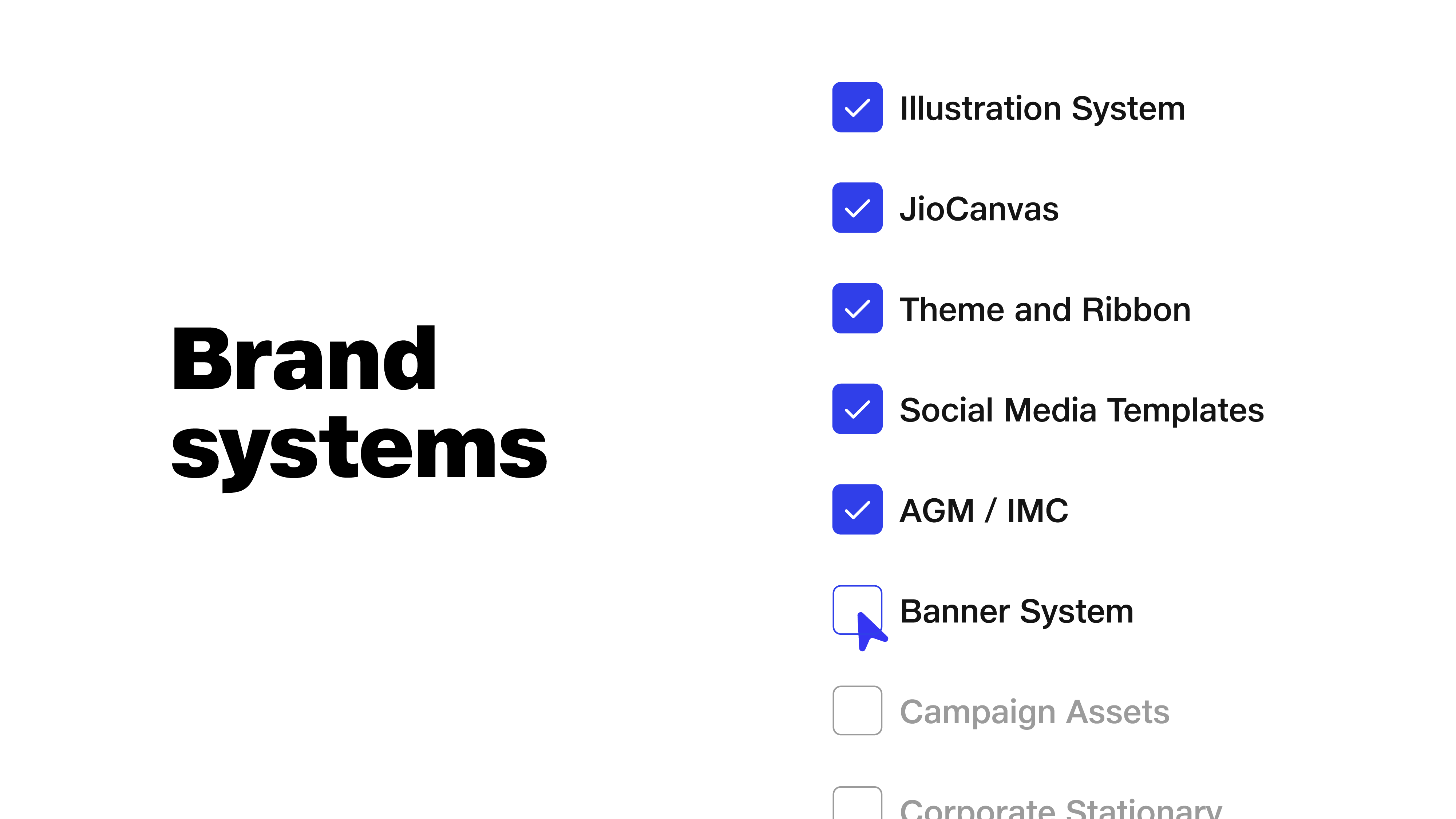
Assets –
Design Elements
Marketing Assets
User Interface
Social Spot Ads
Tools –
Adobe After Effects
Adobe Illustrator
Figma
Adobe XD
Challenge –
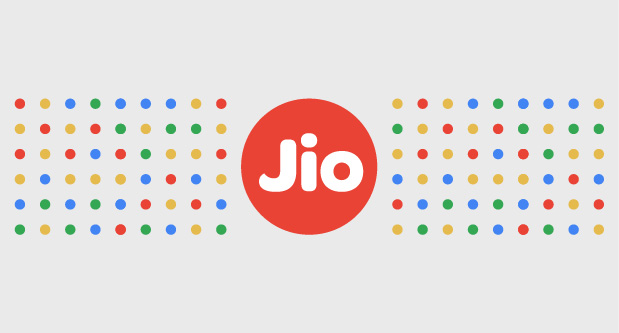
To effectively showcase the partnership with Google through a bold and impactful visual representation by combining Jio's brand elements with Google's color theme.
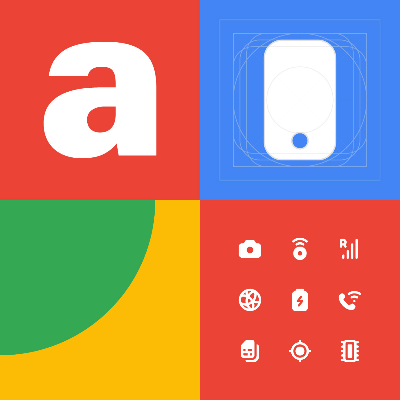


Brand Elements
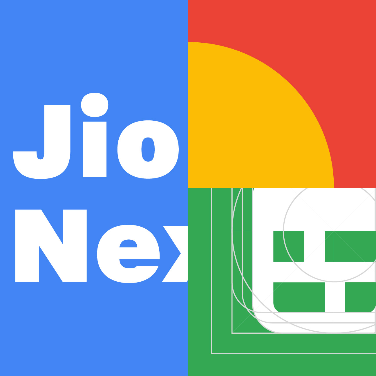
01. Logo →

Left aligned workmark
Center aligned wordmark
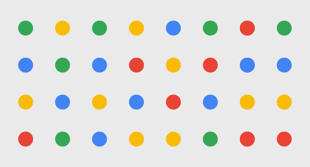
02. Colours →
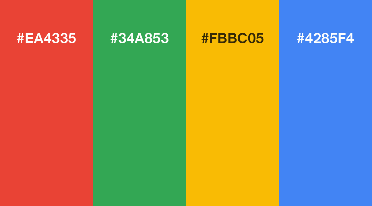
Google Pallete #455
03. Typography →
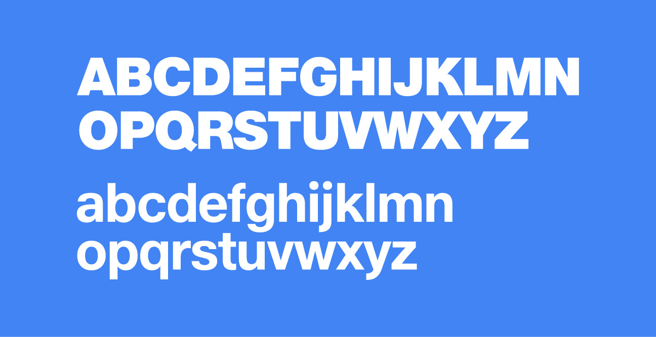
JioType Variable

Headlines and subtitles
Titles and highlights
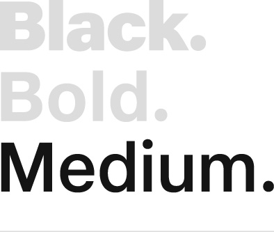
Body copy and captions
04. Patterns & Elements →
The JioDot –
The JioDot is the brand logo of Jio. Derived from the 'bindi' and Indian calligraphy, The JioDot represents the intersection of Indian heritage with the modern digital age.
Dot Grid –
Dots placed adjacent to each other equidistantly create Jio’s dot grid pattern. This is a graphical asset that extends this design language to build visual relationships across product ecosystems.
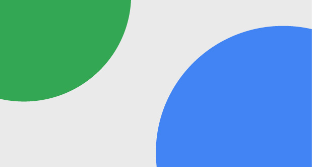
Cut circles –
A stylistic element introduced to the brand was that of circles extending beyond the canvas. These could be used as text or cut-out image containers, only to be used in Google colours.
The Ribbon –
Jio’s brand association with the ribbon is forms its core identity. If any pattern is to be used externally for standalone brand purposes, the ribbon is given preference above all else.
05. Photography →

Product shots –
Product images are shot at interesting angles to enhance a product’s design details, features and hardware. Choose images with similar photographic techniques coupled with angled shots for harmony across a page.

Lifestyle Images –
Lifestyle images help users relate to the brand and for visual storytelling. Images should be warm, positive, contextual and authentic, about Indians using the phone in their day-to-day lives.
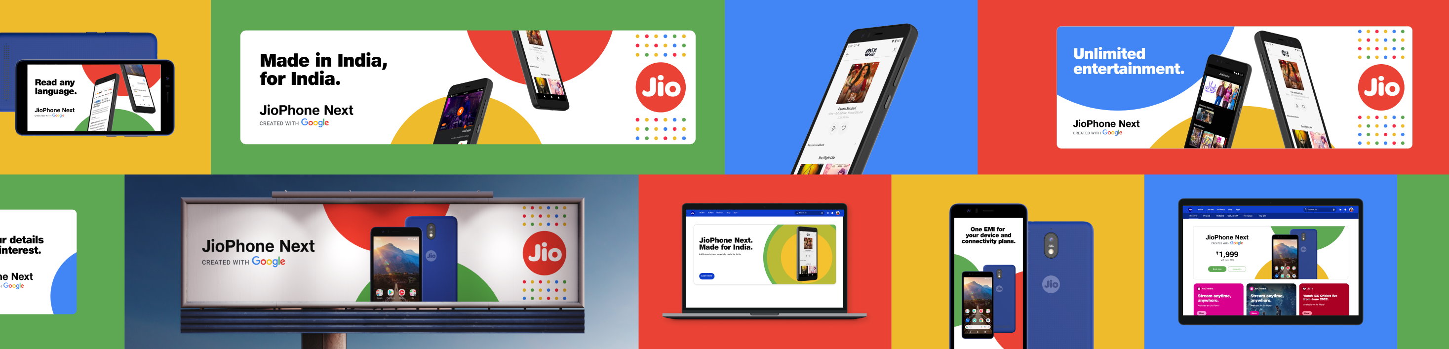
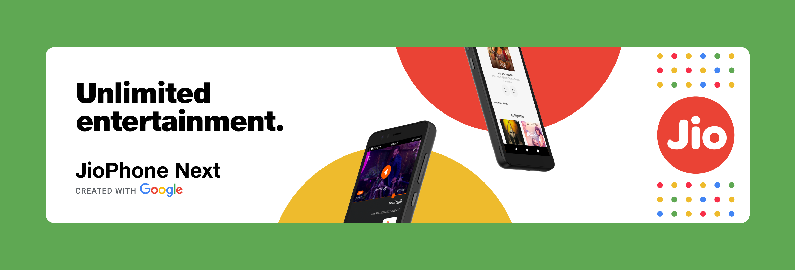
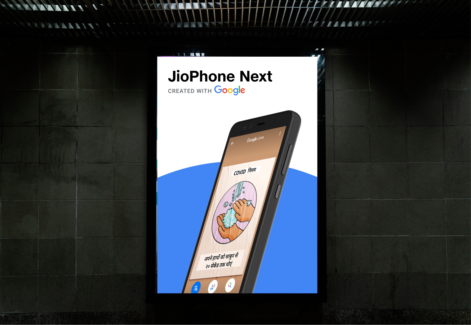
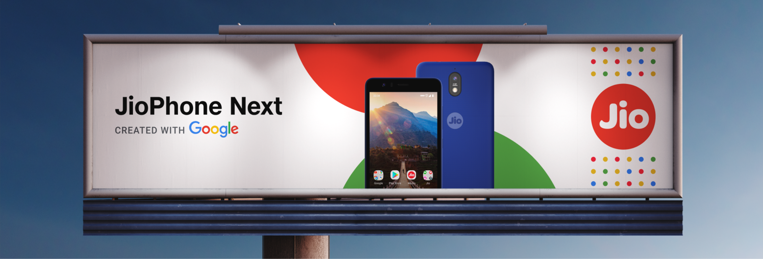
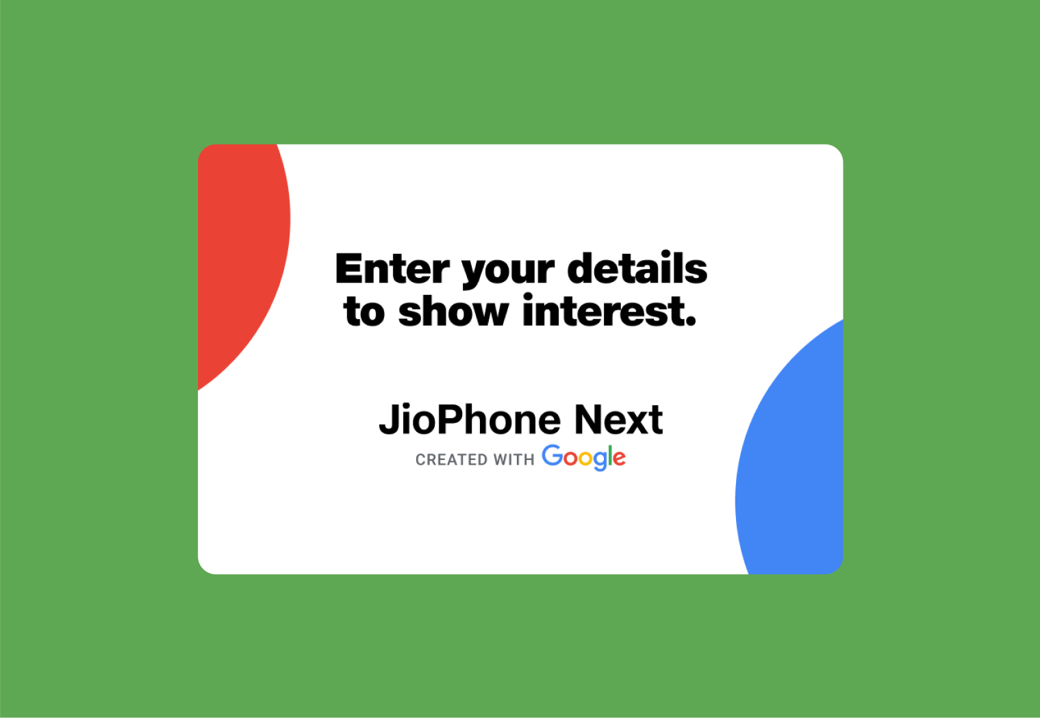
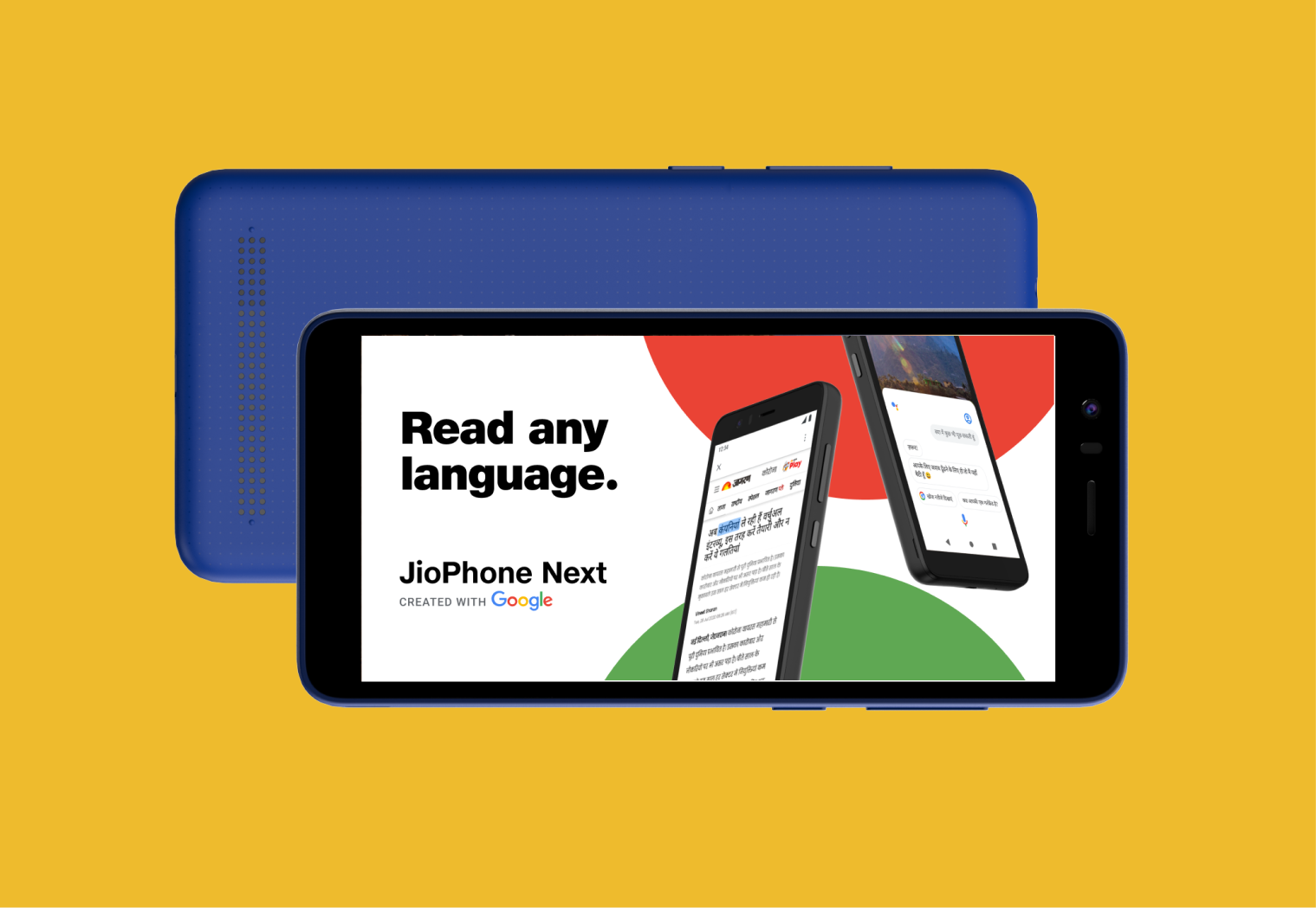
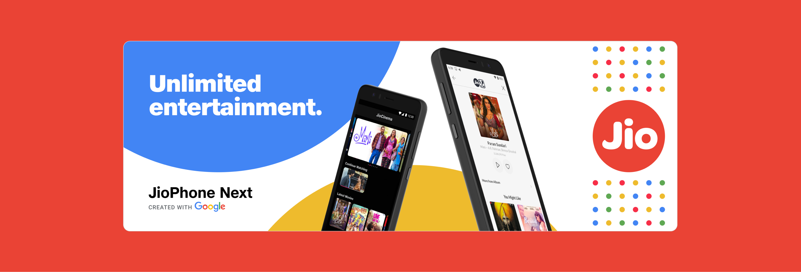
Marketing Assets
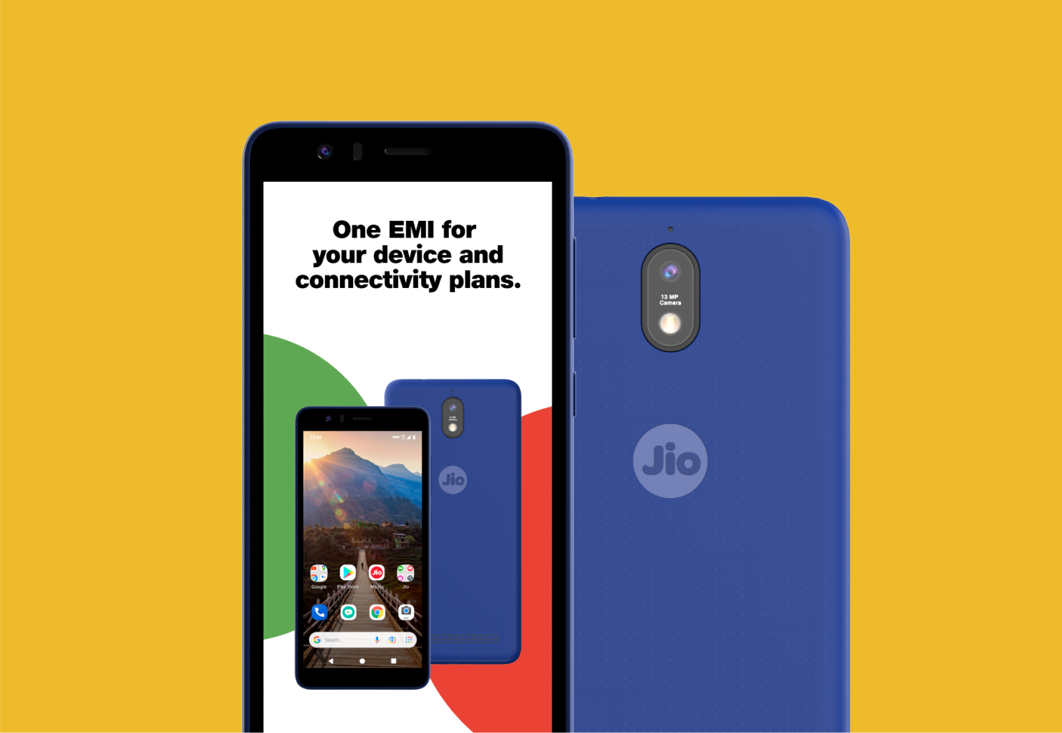
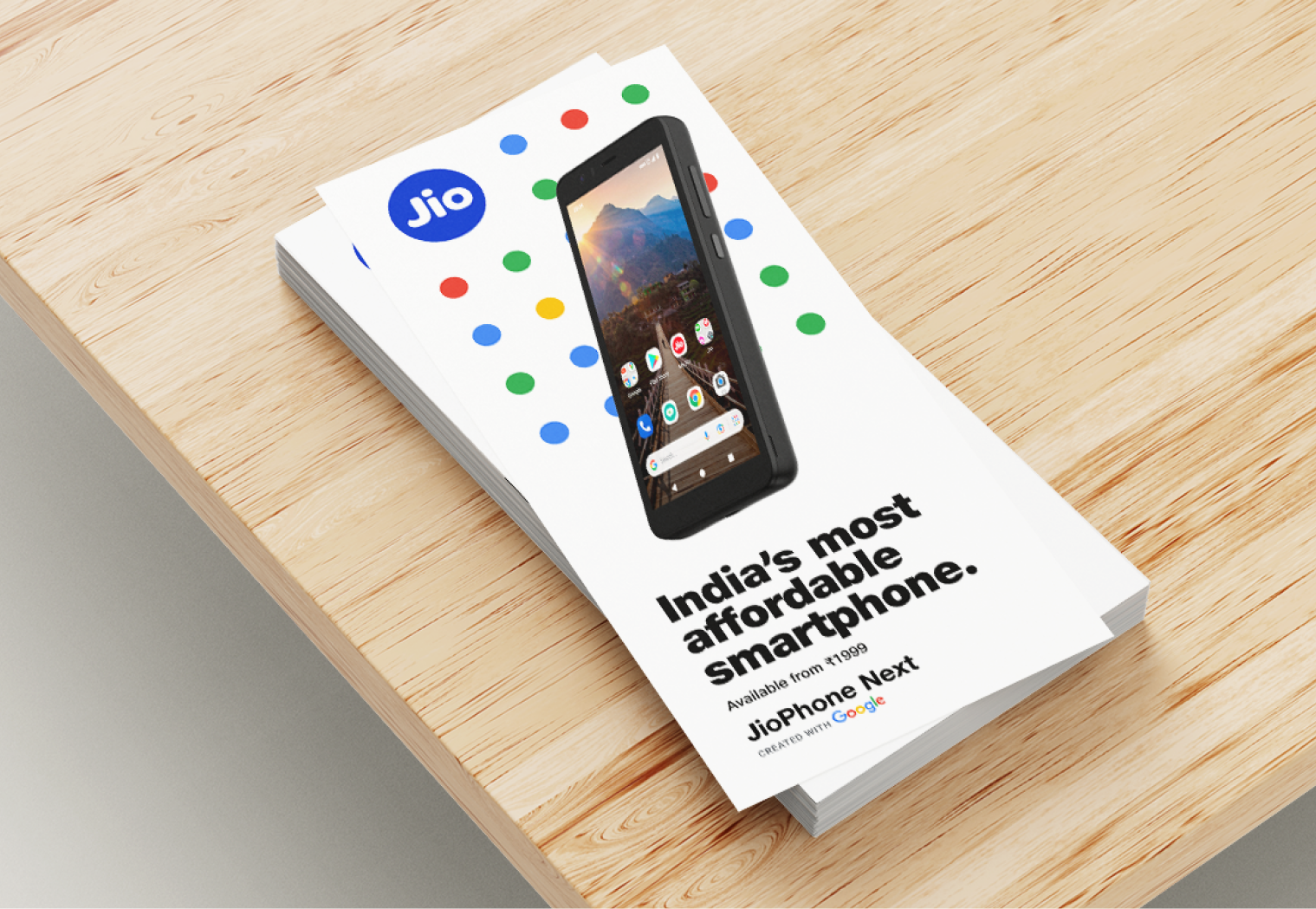
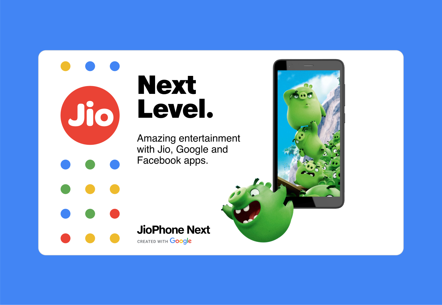
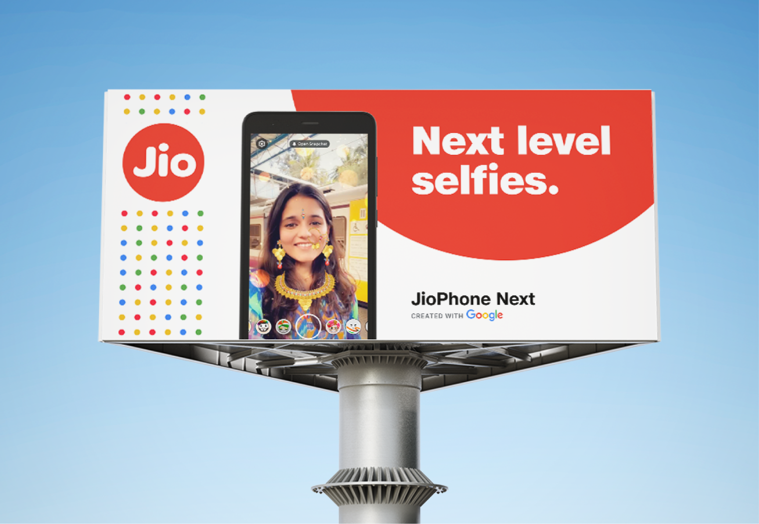
We conceptualized and implemented a new, streamlined branding for JioPhone Next's marketing materials. The primary focus was to develop an identity system that not only appeals visually but also has the ability to scale efficiently.
To achieve this, we devised a scalable system, comprising of templates and guidelines, enabling anyone to create marketing assets that adhere to the JioPhone Next design language.
Process –
Iteration
Concept
Layout Design
Feedback
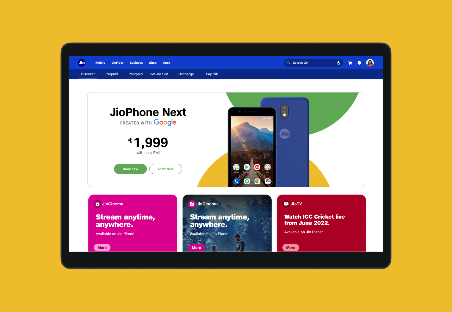
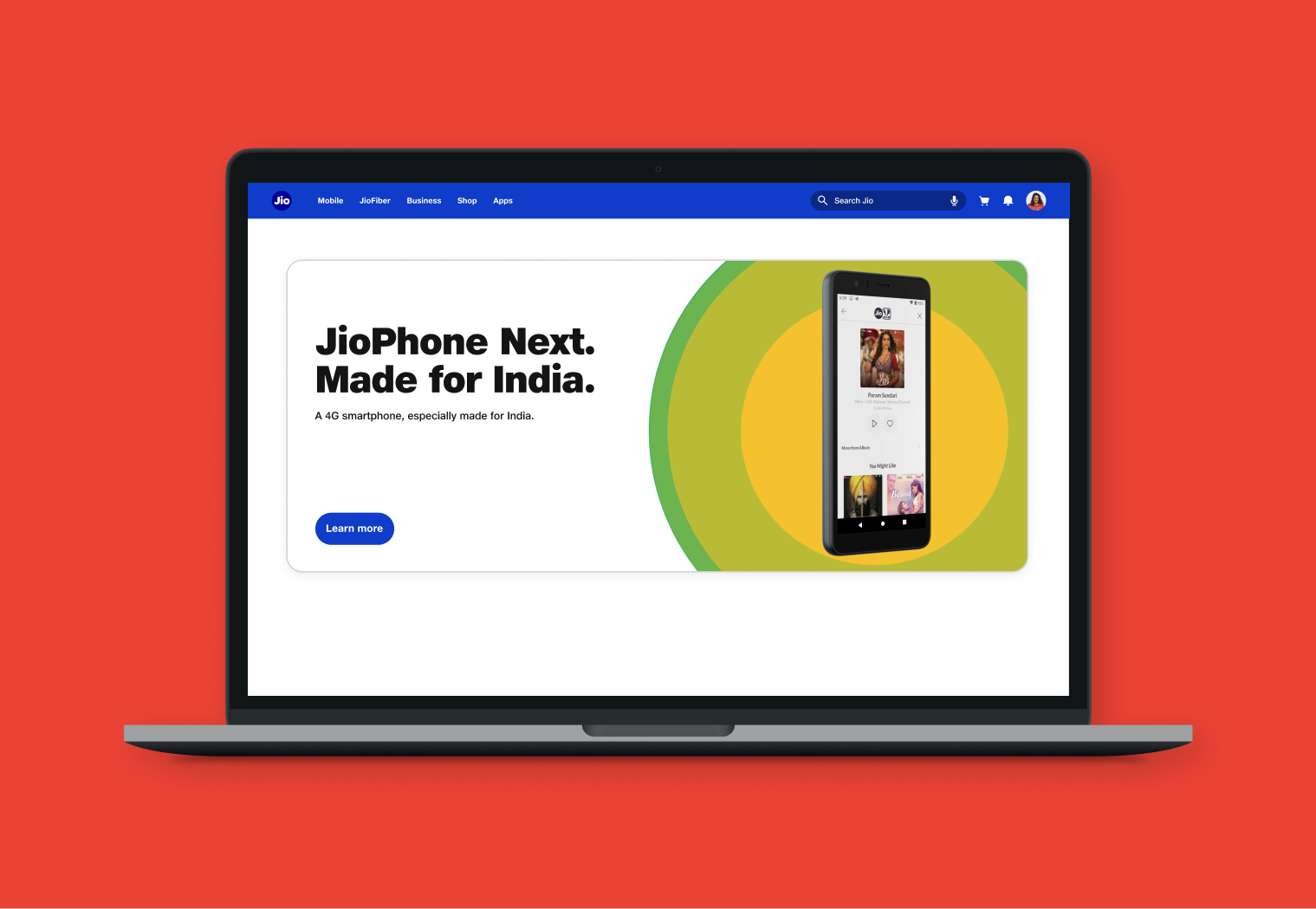
Website Design
We designed a responsive website that serves as the primary landing page for JioPhone Next. The primary objective was to modernize the visual identity of the previous product webpages by incorporating a clean and vibrant aesthetic. The website is designed to emphasize the functional aspects of the product, specifically by highlighting its specifications and features.
Check out the website here.
Process
Info architecture
UI design
Content writing
Handover to devs
Old design
New design
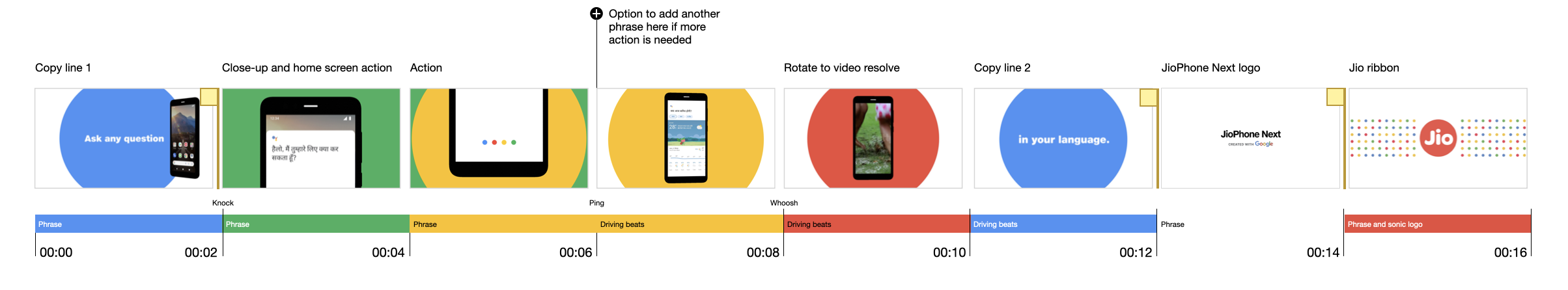
Social Spot Ads
Social spots are advertisements that are short, focused promotional materials. These are shorter than tv commercials and last for less than 30 seconds. These 8 spot ads were made for the promotion of the 8 hero features that jiophone next boasts of, to be marketed on all social media platforms.
Process
Conceptualisation
Storyboarding
Execution
Feedack
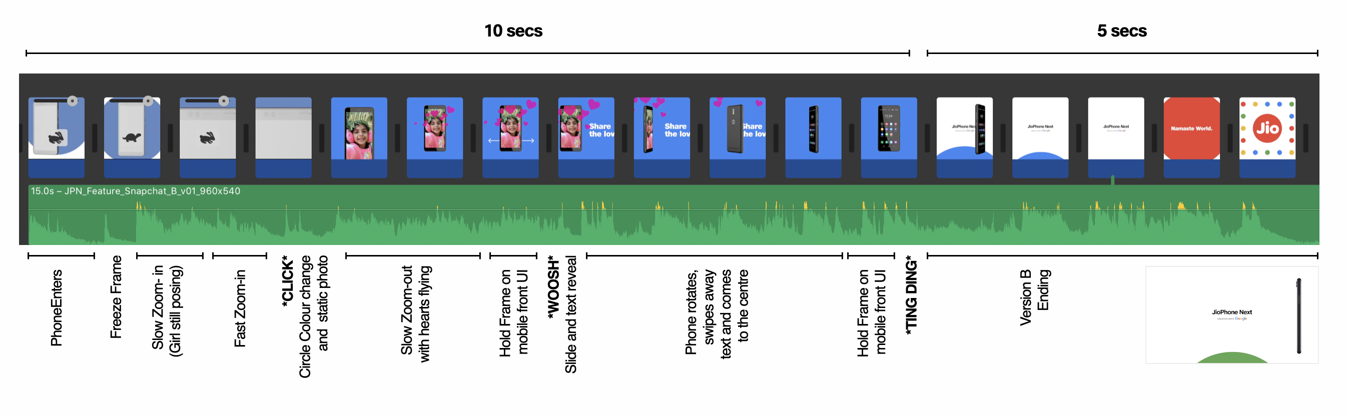
Fun fact
That's me in the selfie video, trying to save production time and cost of hiring a model ;_;
Other Projects
Alt BuildsLocked
Jio Design SystemLocked
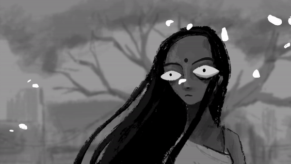
Afloat FilmAnimation
JPN Branding and UIBrand Design
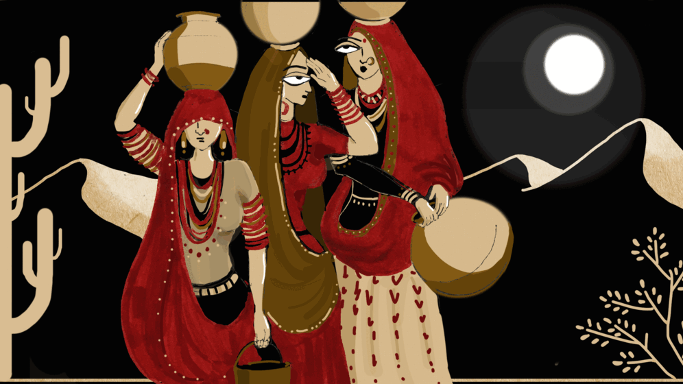
Daily Narratives of the NaariVisual Design
Prothesis App UI UXUI/ UX Design
Workshop Brochure and WebpageVisual Design