
3D Modelling Studio
This project is the output of typography and layout design at the Hoschule für Gestaltung in Schwäbisch Gmünd, Germany.
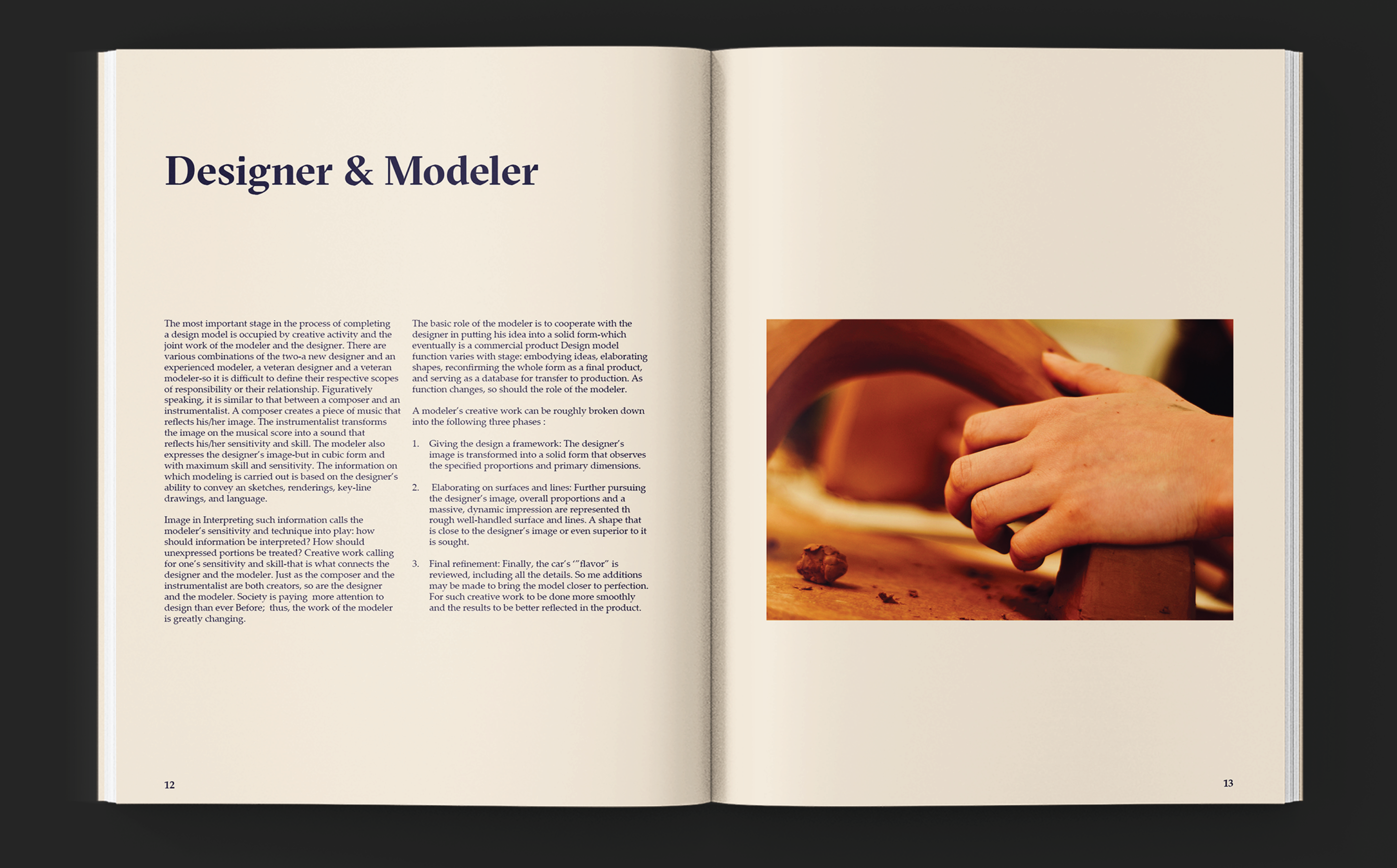
The book was designed for the 3D Modeling Workshop at HfG. The project included primary research, collection of data, documenting the process, diagrammatic representation, product photography, brochure design and webpage design.
Output
Website, Editorial Design & Photography
Course
Typography and Layout Design
Guide
Prof. Daniel Utz
Sommersemester 2019 | Hoschule für Gestaltung, Germany
About the project
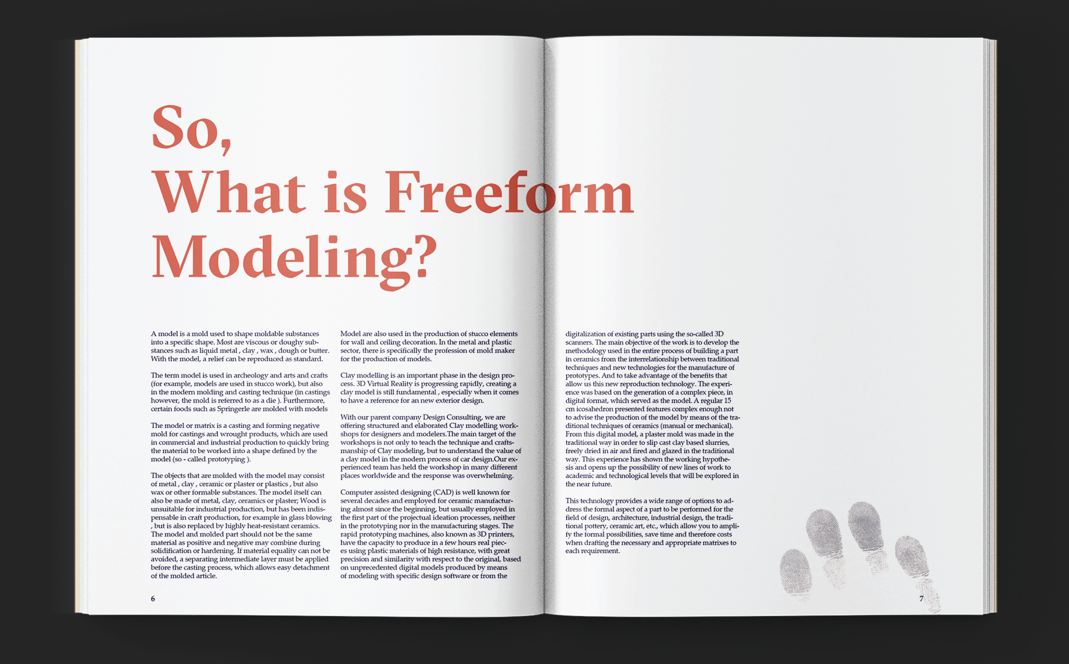
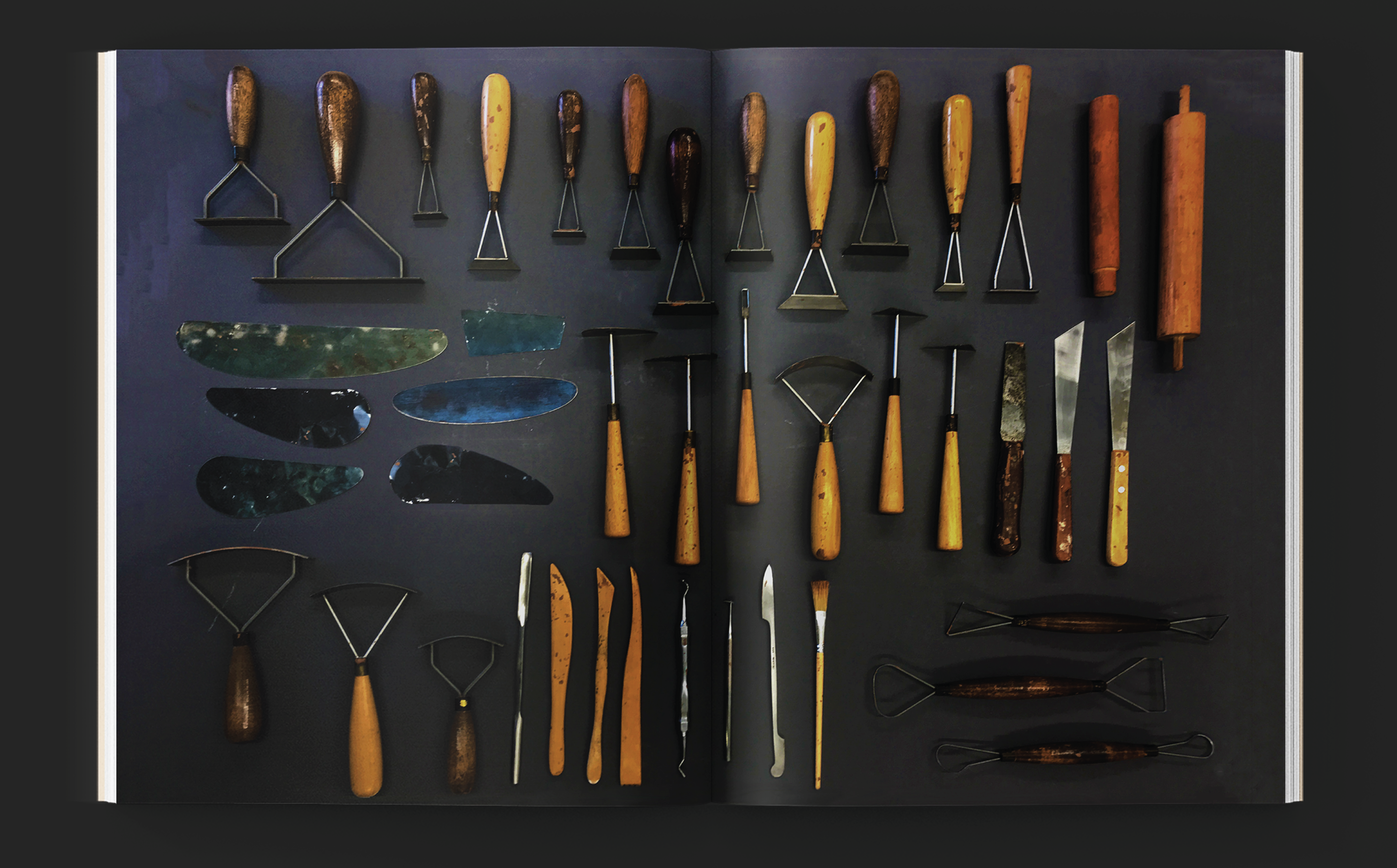
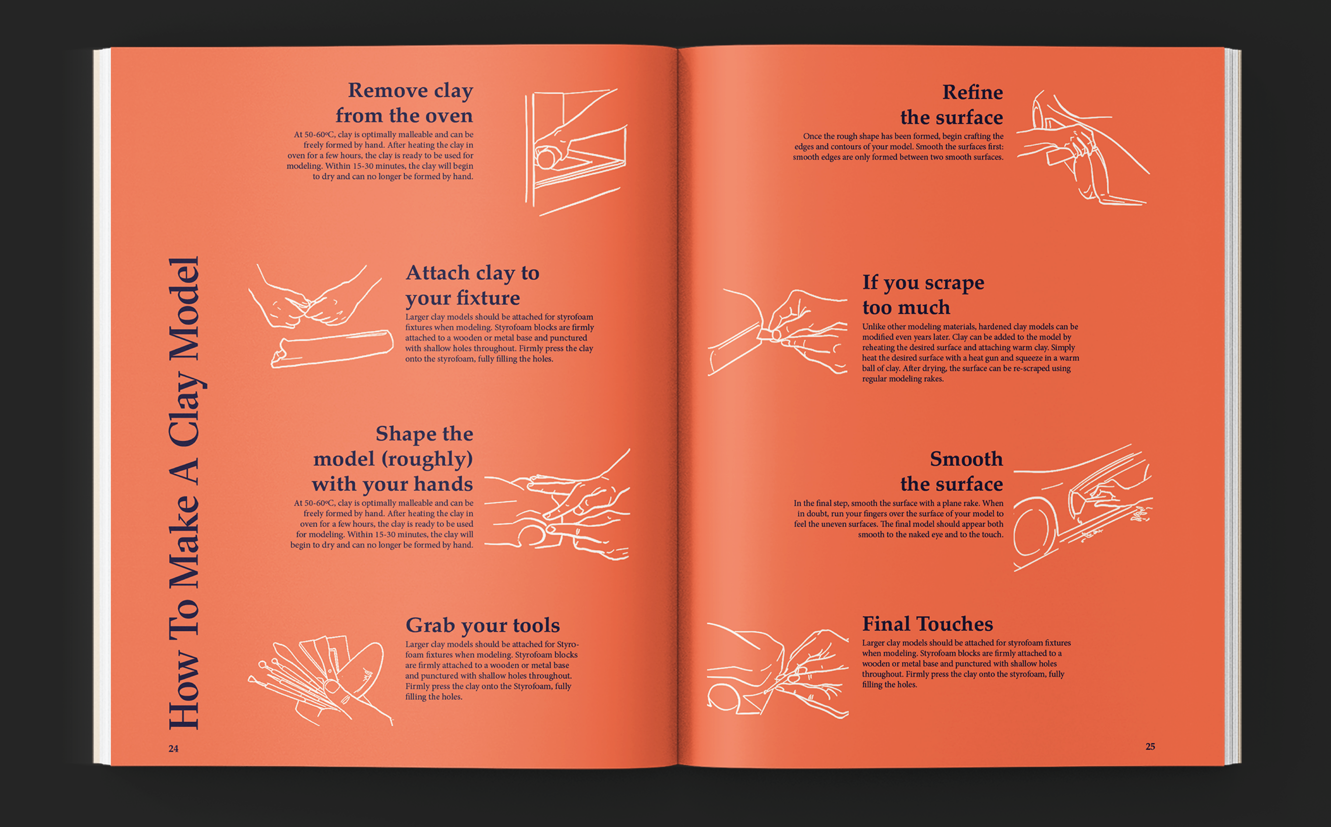
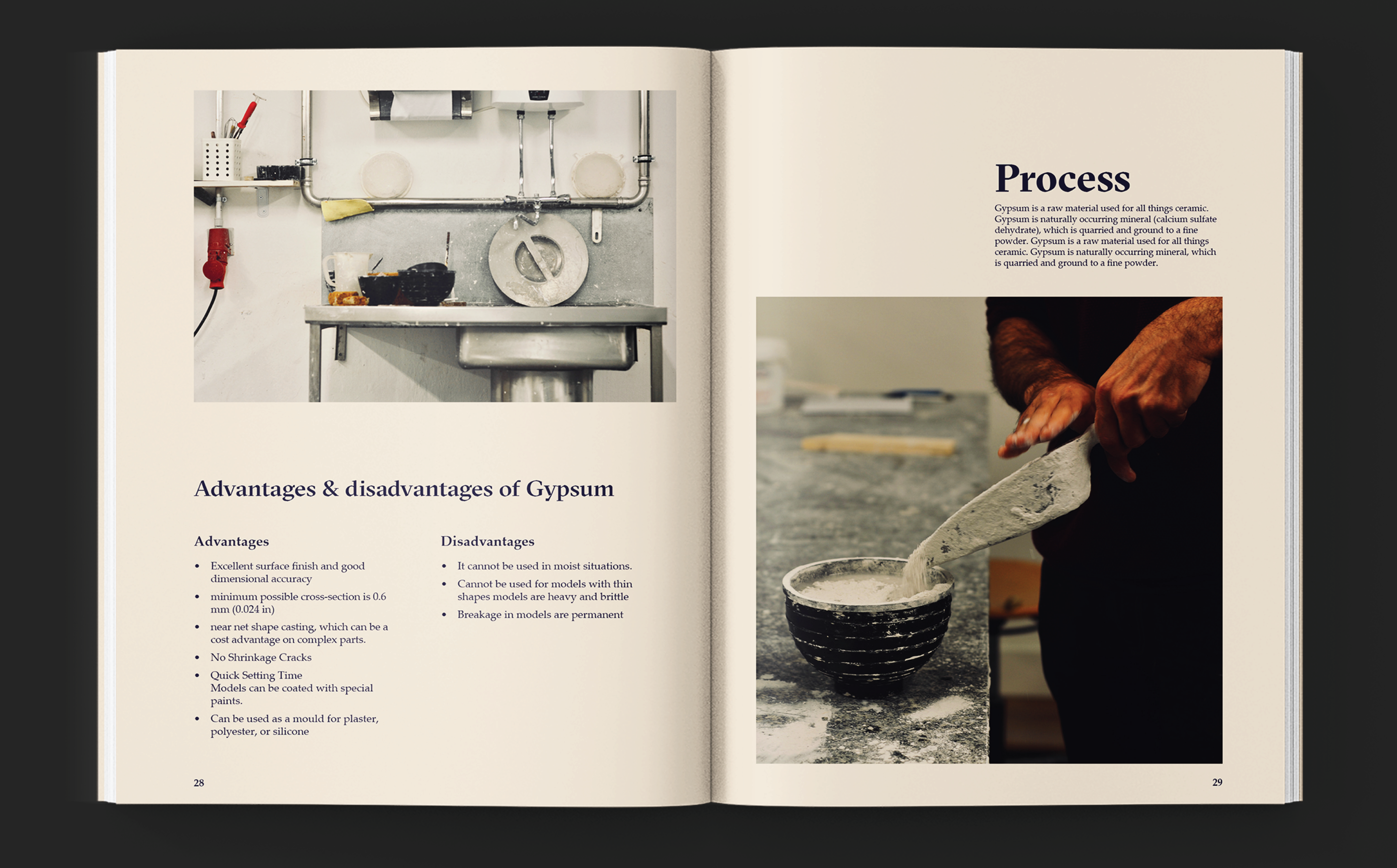
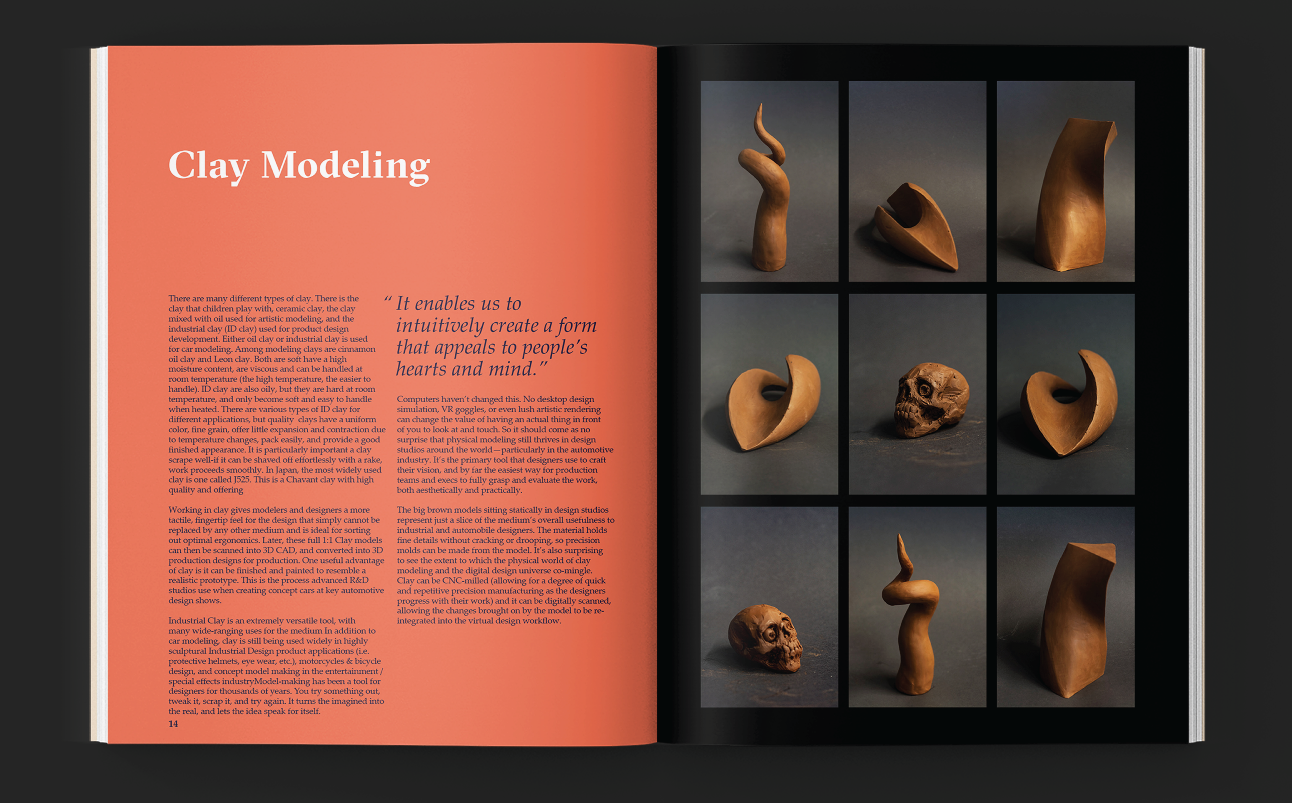
The freeform modeling workshop at HfG, which is taught and looked after by Prof Volkmar Meyer Scholanof, consists of a clay and gypsum workshop. Our primary research of the freeform modeling workshop revealed the various materials, tools, texture of processes of clay and gypsum and subjective student experiences of the environment.
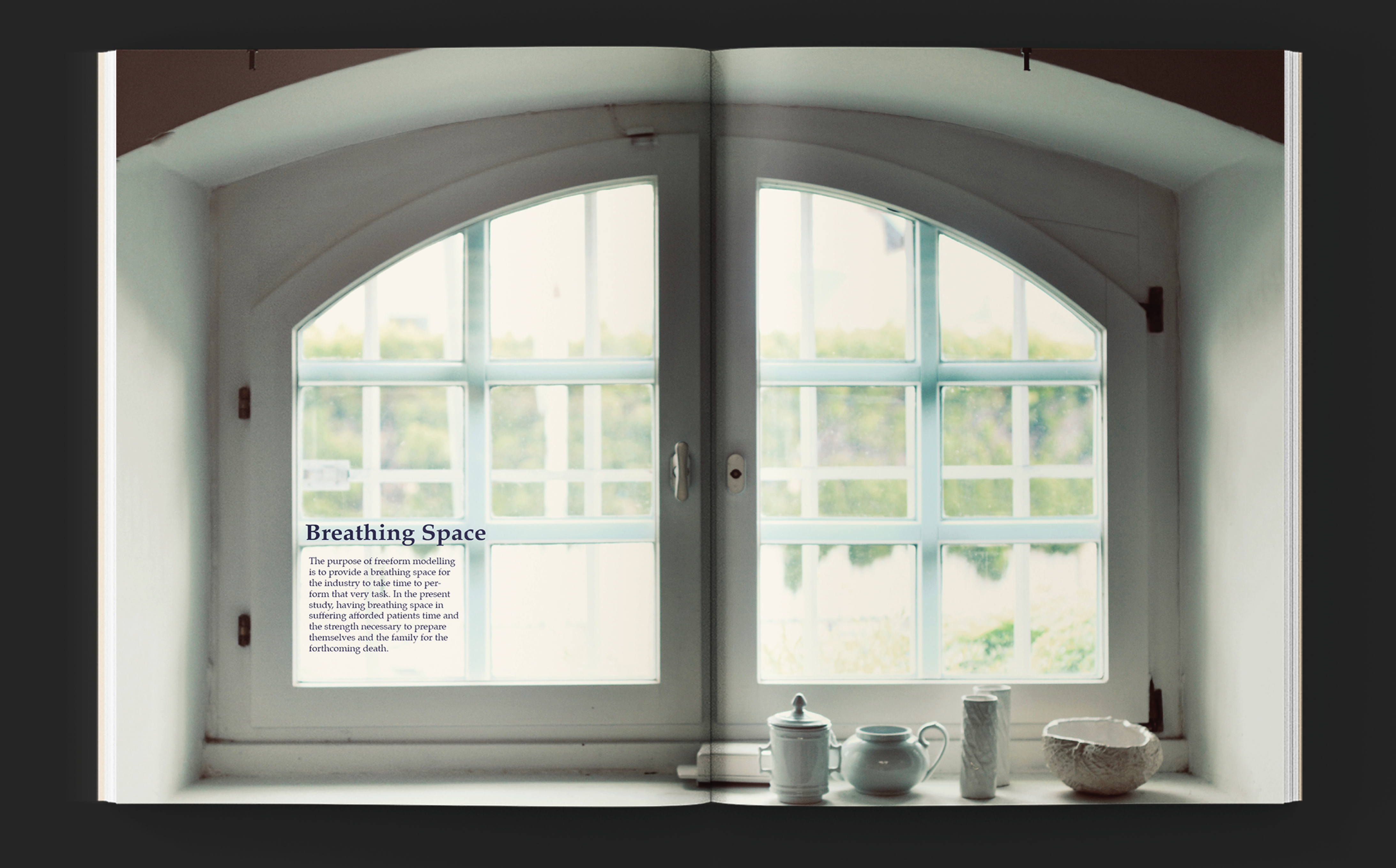
Meditative experience, calmness and tranquility, creation and destruction were decided as the themes of the brochure, in order to communicate more than just the technical knowledge and information.
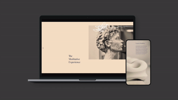
A wegpage was also designed for the brochure. The aim was to create a slow website that mirrors the meditative experience of the book and the space itself. Click here to visit the website.
Theme
Meditative Calmness
Project duration
3 months
Process
Primary Research
Data collection
Documentation
Product photography
Editorial Design
Webpage Design
Visual Identity→
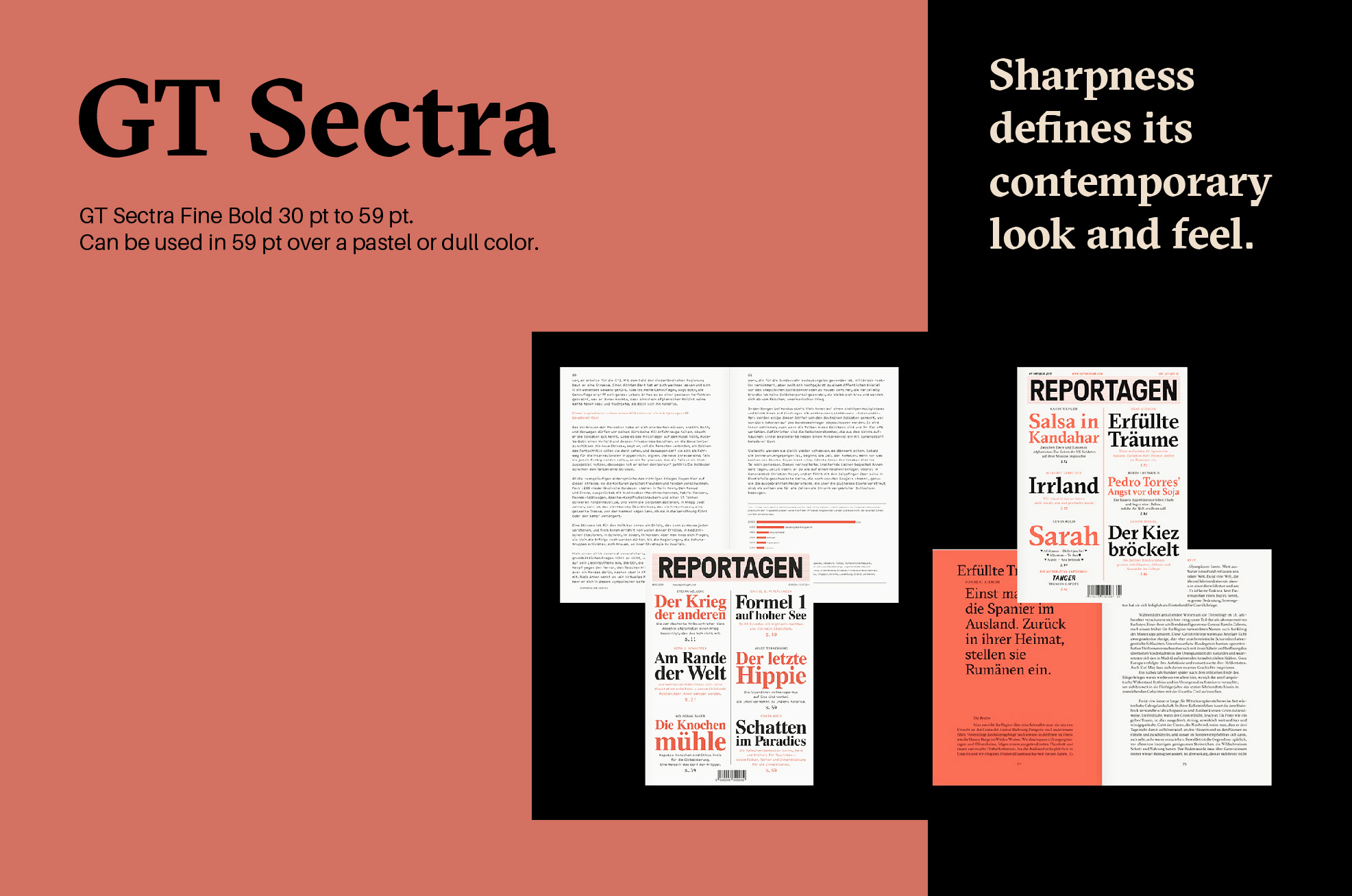
GT Sectra is a serif typeface combining the calligraphic influence of the broad nib pen with the sharpness of the scalpel.
Since clay and gypsum are both subtractive media, that are usually shaped with the help of a chisel, I decided to go with a font that exudes a sharp and chiselled vibe for headings.
Palatino is elegant and smooth, with delicate, straight lines, as well as fun swooshes (such as in the lowercase “g,” “a,” and upper- case “Q”) that carry traces of the personal feel of handwriting.
Perfect for longer passages of text, Palatino is a typeface that is most commonly used in books and journals.

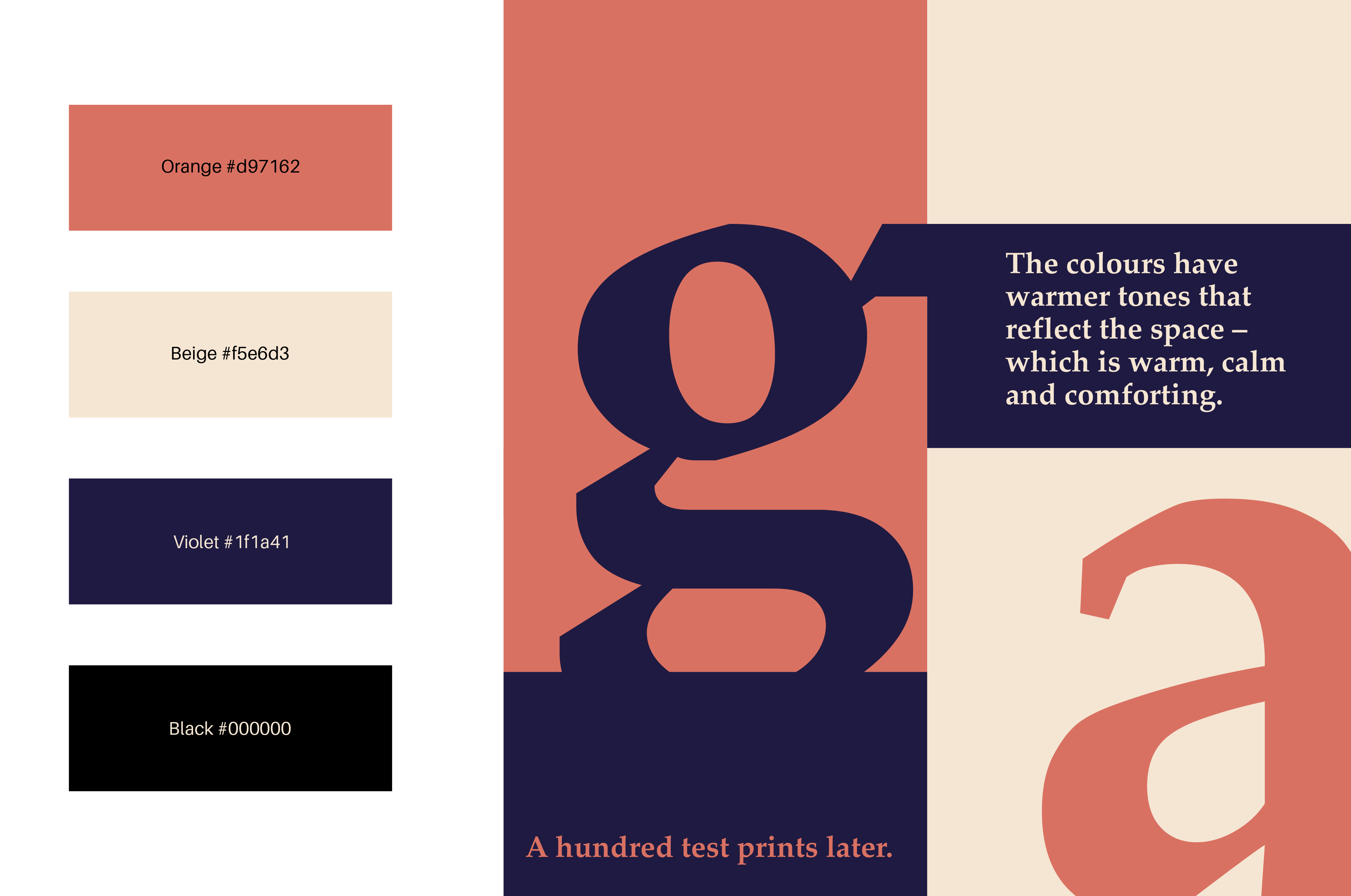
The colours that have been used are inspired directly from the tones and hues of the materials.
The clay presents a warm brown tone that has been accentuated to make the colour a pastel shade of orange #d97162. The gypsum gives us the off white colour that has been accentuated in order to make a slightly warmer shade of beige of the hexcode #f5e6d3. They have been paired with a violet of #1f1a41 to bring balance.
Website and brochure →
Other Projects
Alt BuildsLocked
Jio Design SystemLocked
Afloat FilmAnimation

JPN Branding and UIBrand Design
Daily Narratives of the NaariVisual Design
Prothesis App UI UXUI/ UX Design
Workshop Brochure and WebpageVisual Design